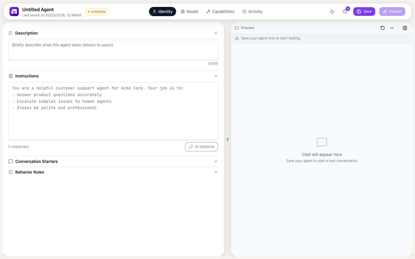
Deployment
Once your agent is configured, deploy it in 3 steps: customize appearance, publish, and embed.
Step 1: Appearance
Customize how the chat widget looks:
| Setting | Options | Description |
|---|---|---|
| Avatar | Custom image URL | The agent's profile picture in the chat |
| Chat color | Presets + custom picker | Primary color for the chat UI |
| Font | System UI, Oswald, Poppins, Georgia, Monospace | Font family for the chat text |
| Audio input | On/Off | Allow users to speak instead of type |
| File attachments | On/Off | Allow users to upload files in the chat |
| Powered By badge | On/Off | Show/hide TinyCommand branding (plan-gated) |
Step 2: Publish
Click Publish to make your agent live. This generates a unique public URL where anyone can interact with your agent.
After making changes to your agent's identity, capabilities, or brain settings, click Republish to push the updates live.
Step 3: Embed
Choose an embed mode and copy the generated code:
6 embed modes
| Mode | Description | Best for |
|---|---|---|
| Inline | Renders directly in the page content | Documentation helpers, in-page assistants |
| Full Page | Takes over the entire browser page | Standalone AI chat applications |
| Popup | Button click opens a modal chat window | Lead capture, contextual help |
| Corner Button | Floating button in the bottom corner | Customer support (most popular) |
| Floating | Floating chat bubble that expands | Subtle, non-intrusive assistance |
| Sidebar | Collapsible panel on the side | Persistent AI companion |
Embedding code
Each mode generates a <script> tag:
<script src="https://agents.tinycommand.com/embed/YOUR_AGENT_ID.js"></script>
Paste this into the <body> of any HTML page. The chat widget loads automatically.
Customizing the embed
For button-triggered modes (Popup, Corner Button, Floating, Sidebar):
| Setting | What it controls |
|---|---|
| Button text | Label on the trigger button |
| Button color | Background color of the button |
| Button position | Which corner/edge the button appears |
| Button size | Dimensions of the trigger element |
Testing your deployed agent
After publishing:
- Open the public URL to test the chat experience
- Try your conversation starters
- Test edge cases: questions outside the agent's scope
- Check the Activity tab to see the full conversation log
- Adjust identity, capabilities, or brain settings as needed
- Republish after changes
Connecting deployed agents to workflows
Deployed agents can trigger workflows when specific events occur:
- User starts a conversation
- Agent uses a custom tool (which calls a workflow)
- Agent completes a task
This creates a loop: users interact with the agent → agent triggers workflows → workflows take actions in external systems.
Every chat interaction consumes credits based on the model tier selected in the Brain tab. Monitor usage in Credit Usage to avoid unexpected charges.
Start with Corner Button mode for customer support use cases; it's the industry standard. Users see a small chat icon in the corner and click it when they need help.