Conversational forms vs. traditional forms: Which is better for your business?
TL;DR
Conversational forms outperform traditional forms on completion rate by 25-40% in most lead generation and survey contexts. But traditional forms still win for short interactions (under 5 fields), checkout flows, and data entry tasks. The format matters less than the friction you remove. Pick based on what you're collecting, not what looks trendy.
I've watched hundreds of teams agonize over this decision. Conversational or traditional? One question at a time, or everything on one page? They spend weeks debating the layout while ignoring the actual problem: their form asks for too much, too soon, with no clear reason why.
So let me save you some time.
The format of your form matters. But it matters less than most people think. What matters more is whether you've earned the right to ask each question. Whether the person filling it out understands what they get in return. Whether you've removed every ounce of unnecessary friction.
That said, there are real differences between conversational and traditional forms. Real data behind those differences. And real situations where one format crushes the other.
Let me walk through all of it.
What makes a form "conversational"?
A conversational form shows one question at a time. You answer, it advances. The next question appears based on what you just said. It feels like a dialogue, not a spreadsheet.
Traditional forms are the opposite. All fields visible at once. Name, email, phone, company, budget, message, CAPTCHA, submit. You've filled out a thousand of them. They look like paperwork because they are paperwork.
The conversational format was popularized by Typeform around 2012. The idea was simple: if you structure a form like a conversation, people treat it like one. They engage more. They drop off less. They actually enjoy the process.
That claim turned out to be mostly true. Mostly.
The key differences come down to three things:
Progressive disclosure. Conversational forms hide complexity. A 15-field form feels overwhelming on a single page. But 15 questions shown one at a time? That feels like a quick chat. The total effort is identical. The perceived effort is not.
Conditional logic. Conversational forms make branching natural. If someone selects "Marketing" as their department, the next question can ask about campaign types. Traditional forms handle this too, but it's clunky. Fields appearing and disappearing on a static page feels buggy. In a conversational flow, it feels intentional.
Focus. One question on screen means one decision at a time. No scanning ahead. No anxiety about how long this will take. You just answer what's in front of you.
The data: form completion rates compared (the psychology behind these numbers is in the next section)

Numbers first. Opinions after.
Formstack analyzed over 650,000 form submissions and found that multi-step forms (which share DNA with conversational formats) had 25.4% higher completion rates than single-page forms. That's not a marginal difference. That's the gap between a form that works and a form that leaks money.
Typeform's own published benchmarks claim their conversational format achieves completion rates above 50%, compared to an industry average of roughly 20-30% for traditional web forms. Take those numbers with a grain of salt since they're from the company selling the product, but the directional finding matches independent research.
A study from the Baymard Institute on checkout abandonment found that 22% of users abandon forms because the process was too long or complicated. Conversational forms address this directly by breaking the process into digestible steps.
HubSpot ran internal tests showing that reducing form fields from 4 to 3 increased conversions by almost 50%. The conversational format takes this principle to its logical extreme: you see exactly one field. Always.
WPForms reported that multi-page forms can convert up to 300% better than equivalent single-page versions for longer surveys.
The pattern across all this data is consistent: when you have more than 5-6 fields, breaking them up improves completion. The conversational format is the most aggressive version of "breaking them up."
When conversational forms win
Not every form should be conversational. But when the format works, it works convincingly.
Lead generation forms (6+ fields). This is where conversational forms earn their reputation. You need name, email, company, role, team size, budget range, timeline. That's seven fields. Show them all at once and watch your completion rate drop below 20%. Show them one at a time, with each question feeling like a natural follow-up, and you'll clear 40%.
Surveys and feedback collection. People hate surveys. They especially hate surveys that look like they'll take 20 minutes. A conversational survey with a progress indicator feels shorter even when it isn't. SurveyMonkey's research shows that perceived length affects completion more than actual length.
Onboarding and qualification flows. When you need to route someone to the right product, plan, or team member, a conversational flow feels like being helped. A traditional form with 12 fields and a "Submit" button feels like applying for a bank loan.
Mobile users. This is the one nobody talks about enough. On a phone screen, a traditional form with 8 fields means scrolling, tapping into fields, fighting autocorrect, scrolling more. A conversational form shows one large input area per screen. Tap, type, next. The mobile completion rate difference is even larger than desktop, sometimes 50-60% higher according to Zuko's form analytics benchmarks.
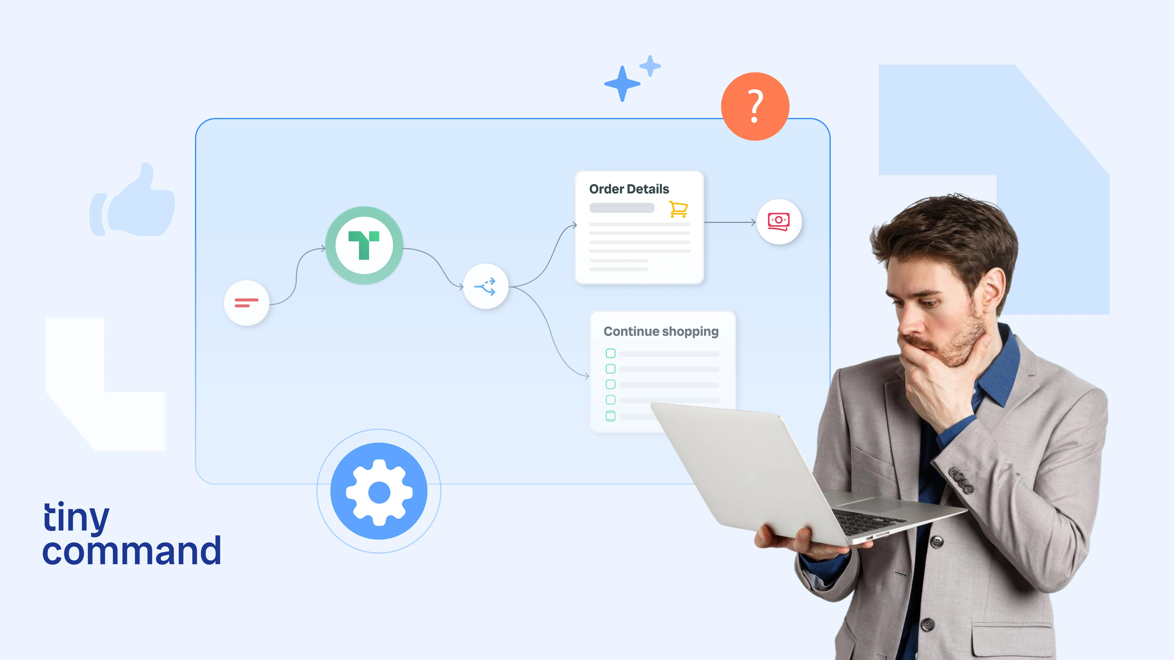
When traditional forms are actually better (or combine both — see the hybrid approach below)
.webp)
Here's where I disagree with most articles on this topic. They'll tell you conversational forms are always better. They're not. Sometimes they're actively worse.
Short forms (1-4 fields). If you're collecting name and email for a newsletter signup, a conversational form is overkill. Showing one field at a time when there are only two fields feels patronizing. Like the form is stalling. Just show both fields. Let them fill it out in 8 seconds and move on.
Checkout and payment flows. People want to see their shipping address, billing info, and order summary in context. They want to review before clicking "Pay." A conversational flow that hides the total until the last step creates anxiety, not engagement. Baymard Institute found that 18% of cart abandonment happens because users can't see or calculate total order cost upfront.
Data entry and admin tasks. If someone is entering 50 employee records into a system, they don't want to click "Next" 50 times per record. They want a table. A grid. Something they can tab through without thinking. Conversational forms optimize for engagement. Data entry needs to optimize for speed.
Returning users who know the form. Your support team files the same ticket form 30 times a day. They've memorized the fields. A conversational format that forces them through a step-by-step flow every single time will drive them insane. Give them the full form. Let muscle memory do its work.
When context matters. Sometimes seeing all the fields at once helps people prepare their answers. An insurance quote that asks about property details, coverage history, and claims data is easier to complete when you can scan ahead and gather the right documents before starting.
The psychology behind the gap
The completion rate difference between conversational and traditional forms isn't random. Three cognitive principles explain almost all of it.
Cognitive load theory. Working memory handles about 4-7 items at once, according to Miller's classic 1956 research. A form with 12 visible fields exceeds that capacity. Your brain has to process the whole thing before deciding to engage. A single question doesn't trigger that overload response. You just answer it.
Commitment and consistency. Robert Cialdini's research on persuasion showed that once people take a small action, they're more likely to continue with larger ones. In a conversational form, answering the first question is a micro-commitment. By question five, you've invested effort. Abandoning feels like wasting that effort. Traditional forms don't create this escalating commitment because you haven't done anything until you click "Submit."
The Zeigarnik effect. People remember incomplete tasks more than completed ones. A progress bar showing "60% complete" on a conversational form creates psychological tension that pushes toward completion. It's the same reason you finish a mediocre Netflix series. You're already four episodes in.
Traditional forms offer none of this. There's no progress. No momentum. Just a wall of fields and a button.
Real examples: before and after
Example 1: SaaS demo request. A B2B SaaS company had a traditional demo form with 9 fields on one page. Completion rate: 12%. They rebuilt it as a conversational flow, same 9 questions, and added conditional logic (if team size is under 10, skip the "enterprise needs" question). Completion rate jumped to 28%. That's a 133% lift from a format change alone. No reduction in data collected.
Example 2: Event registration. A conference registration form collected name, email, company, role, dietary restrictions, session preferences, and t-shirt size. Seven fields, all visible. Completion rate: 34%. They switched to a conversational layout that grouped related questions (personal info first, then event preferences). Completion rate: 51%. But here's the interesting part: they also saw a 40% reduction in support tickets asking "did my registration go through?" The step-by-step format made people feel more confident their answers were recorded.
Example 3: Customer feedback survey. A 15-question NPS survey had an 11% completion rate as a traditional form. Rebuilt as a conversational flow with one question per screen and a progress bar, the completion rate hit 38%. The key change wasn't just format. They added conditional routing: if someone gave a score of 8+, they saw different follow-up questions than someone who scored 3. The survey got shorter for happy customers and longer for unhappy ones. Traditional forms can't do this gracefully.
Building both without code (using what we learned from the examples above)
Here's where this gets practical.
TinyForms supports both conversational and traditional modes in the same builder. You design the form once. Then you flip a toggle. Conversational mode shows one question per screen with smooth transitions and a progress indicator. Traditional mode shows the full form on a single page.
This matters because you shouldn't have to rebuild your form to test the other format. Build it once. Run both versions. See which one performs better for your specific audience.
You can also use conditional logic in either mode. Skip questions based on previous answers. Show different paths for different user types. Pipe answers from earlier questions into later ones ("You mentioned you're in Marketing. What campaigns are you running?").
The embed options work the same for both formats: inline, popup, slide-in. And the submissions go to the same TinyTables database regardless of which mode collected them. So you can switch formats mid-campaign without losing data continuity.
If you want to automate what happens after submission, connect the form to TinyWorkflows. Route leads to different CRMs based on their answers. Send personalized follow-up emails based on which path they took through the form. The format of the form is just the front door. What happens after someone walks through it is what turns a submission into a customer.
The hybrid approach
The most effective forms I've seen aren't purely conversational or purely traditional. They're hybrids.
Start conversational, end traditional. Use the one-question-at-a-time format for the first 3-4 qualifying questions, where engagement and commitment matter most. Then show the remaining fields on a single page for quick completion. You get the commitment escalation of conversational plus the speed of traditional.
Another hybrid: conversational on mobile, traditional on desktop. Mobile users benefit more from the single-question format because of screen size constraints. Desktop users can handle seeing more fields at once. Detect the device and serve the right format.
And there's the progressive form strategy. Start with a 2-field traditional form (name and email). After submission, show a conversational follow-up that asks qualifying questions. You capture the lead immediately with the short form. Then you enrich the data with the longer conversational one. If they drop off the second form, you still have their contact info.
The point is: this isn't a binary choice. The teams getting the best results are mixing formats based on context, device, and where someone is in the funnel.
FAQ
Do conversational forms always have higher completion rates than traditional forms?
No. For forms with fewer than 5 fields, traditional formats often perform equally well or better. The completion rate advantage of conversational forms is most significant for longer forms with 6+ fields, where the single-question format reduces perceived complexity. Short forms don't benefit because there's no complexity to reduce.
What is a good form completion rate?
It depends on form length and context. For a 2-3 field email signup, 30-50% is typical. For a 7-10 field lead generation form, 15-25% is average in traditional format and 30-45% in conversational format. For surveys with 15+ questions, anything above 20% is solid. Zuko's benchmarks provide detailed breakdowns by industry and form type.
Can I use conditional logic in traditional forms?
Yes, but it's less elegant. Traditional forms can show and hide fields based on selections, but users see the layout shift in real time, which can feel disorienting. Conversational forms handle conditional logic more naturally because each question is already a separate screen. The branching is invisible to the user.
How many fields is too many for a traditional form?
The general threshold is around 5-7 fields. Beyond that, completion rates start dropping sharply. HubSpot's data shows significant conversion drops after the 3-field mark for traditional layouts. If you need more than 7 fields, a conversational or multi-step format will almost certainly outperform a single-page traditional form.
Should I A/B test conversational vs traditional formats?
Absolutely. The benchmarks and averages in this article are useful as starting points, but your audience is specific. A B2B enterprise audience might prefer traditional forms because they're used to filling out procurement paperwork. A consumer audience on mobile might strongly favor conversational. The only way to know is to test both formats with your actual traffic and measure completion rates over a statistically significant sample.
Recommended Blogs